Tuesday, September 9, 2008

Assignment 3


Poster: Warning: Impending Global Disaster

Area of Choice: Changing of Weather

Description: My poster shows a scene of a city during the day and at night. But so it seems. One of the effects of Global Warming is the ever changing of weather. The weather is not stable until we are confused which is night and which is day. During day time, It may be so dark and gloomy, the sun nowhere to be seen. When it’s time for night, the sun is still shining. It is really an impending global disaster. We need to work hand in hand to stop the global disaster. We have to help stop global warming.

Idea: The idea of my poster is to show what is happening. Global warming is a serious issue. Even the weather is changing drastically. Where day seems so gloomy and dark and night isn't night anymore. Colours: The colours that I used is to show contrast between dark and bright.
Dark- Black,grey
Bright- Blue, white

I used some red in the 'warning' to create a more "danger is coming", "beware" kind of effect. The fonts I used also give a somewhat similar meaning of danger is coming.

So this is the end of my assignments for trimester 1. I hope that people will be aware of what is going around them and not be oblivious to their surroundings. Global warming is something that needs to be tackled by, TOGETHER. It is not a one person thing but with each contribution for one person, We can do wonders. So, HELP STOP GLOBAL WARMING.

The Process of My assignment 3

The Process: Step 1:


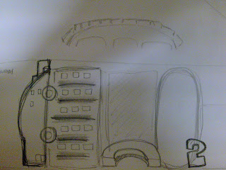
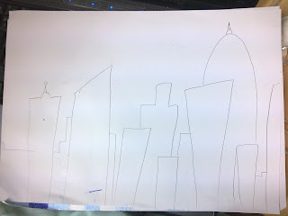
I decided to make my poster landscape style. I divided the poster into two sections.

Step 2:
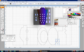
I used the Pen tool as well as the the shape tools. I created an image of a city. If u look closely, You can see the shapes of "CO2", a car and others such as buildings and factories. All these are representations of global warming.

Step 3: I copied over the image of the city from assignment 2.

I also experimented with some swatches colours. Choosing the right colours for the poster.

Step 4:
In tutorial class, We learnt how to use the 3D effects. So I decided to incorporate 3D effects in the lower part city. Using the "extrude and bevel". I experimented few times on the Betrude depth, the height, the bevel and the position. Step 5:
I added in text to the poster.I experimented on the fonts. Finally I found a suitable font for the text. Using the font, "Gils San Ultra Bold".

Step 6:
I created a background for the lower part. Using the gradient effect. Showing a brighter side of the city. Using a soft, cooling colour, BLUE. A little bit of white here and there. In the upper part, I used more dark colours. Black, grey and a slight white at the end.

Step 7: I did some adjustments with the 3D effect. Final Step:


I did some adjustments here and there. Adding in more text. I downloaded some fonts online to use it in my poster.

Finalization of my poster.

Thus,

this is my poster.

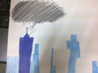
Sketches


References for Assignment 3

References:

http://chipchick.com/wp-content/uploads/2007/12/liofevisa.jpg

http://www.jeffsweather.com/archives/Reuters%20North%20View-%20Con

Basically, I looked for pictures on weather changes in cities and also pictures of imaginary cities.

Friday, September 5, 2008

Assignment 3

Assignment 3 – POSTER (20%)

Based on the symbol and the illustration, you are now required to design a poster to provide overall awareness on the area of your choice. The poster is to give an overall picture of the happenings and the effects of the area of choice.

The poster must be original and based on the research and assignments in the area of choice.

Students are to incorporate the design principles that were learnt in MDP class.

Requirements - ALL WORK MUST BE ORIGINAL!

(1) Based on the facts found in this research on what, why and how global warming is affecting our environment, students are to come up with a statement and brief description on the area of your choice in the context of global warming.

An example could be – “Melting of the polar ice-caps kills the penguins”. Based on this statement, provide a brief description on how this will take place or the effects if this happens.

(2) Then, create a poster to provide visualisation on this based on the statement and description. This is to provide awareness on the area of choice.

(3) The size of the image should be A3 size.

(4) The initial designs should be drawn on paper and later incorporate into the Illustrator software.

(5) You are to use the tools in Illustrator like the pen tool, basic colours, gradient colours, shapes to draw and all the tools that were taught to you this semester. You should also explore other tools & techniques available in Illustrator on your own and incorporate them into your design.

(6) The final outcome of the poster should be printed out and mounted onto a mounting board together with your statement and design brief explaining the statement. Use an appropriate mounting board (one side should contain the final output, while the other must contain the statement, brief and your name, ID and group)

(7) Class rules apply.

Criteria for marking for the poster:

(1) Creative and imaginative idea on your area in relation to global warming
(2)
The concept itself and the proof of concept which are the sketches, references and research.
(3) Use of the tools - the proper and creative use of the tools
(4) Design of the poster and the awareness your are creating based on the statement and area of choice.
(5) Write-up and documentation must be in proper English.
(6)
Detail description of the process.
(7) Quality of the printing and display.

Documentation – Blog (10%)

Students are to document the process of creating this poster using their blog as documentation. Please include the following:

(1) Include the RESEARCH you have done on the area of choice (add the web links)

(2) Include the idea behind the poster containing the statement, the brief and how does your idea visualise both the statement and the brief.

(3) Include designs, sketches, references or images that you use to create your posters

(4) Tools used. You are to EXPLAIN the tools that you used and learnt from the tutorials and EXPLORED. The description should include what tools were used, what was the setting used, why and how it was used in your poster. Be detailed on this and include screen shots.

Submission:

  1. Date of Submission: Week 12 in tutorials to tutorial Group Leader.
  2. Be as detailed as possible as this is the documentation on the process of developing your poster.
  3. All class submission guidelines must be followed. Not following these requirements will mean a reduction in your marks in this exercise.
  4. Any copying or similar images may result in the students getting an automatic "0" mark.

Criteria for marking for the blog documentation:
(1) Write-up and documentation must be in proper English.
(2)
Detail description of the process.
(3) Any requirements that were not followed will result in lost of marks.

Sunday, August 17, 2008

Write up


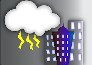
Title: Dark City
Area of choice: Weather changes
The area of choice for these assignments is 'Weather Change'. Weather change is one of the effects of global warming. Firstly, The theme or the effect I wanted for this illustration is a gloomy effect. I tried to create a dark and negative effect. Basically, The title of this illustration tells the story behind this illustration. Well, Maybe a little. As you can see, for the background, I used Grey to create a cloudy day effect. As a huge dark cloud comes upon the city, The city becomes dark and the sun is no where to be seen. But yet, As the cloud comes upon the city, As the buildings are shadowed by the cloud. A building stands out. A building is not overshadowed by the cloud. It is a sign of hope. A sign where even when dark clouds appear, Hope is not lost. I feel that this can be applied even in our personal life. What more in this issue of global warming? As global warming worsens, As the weather are unpredictably changing by the minute, HOPE IS NOT LOST!
Also to create a 'instability' effect, You can see the shape of the blue building and all the windows. You can see the unevenness of it. I would like to use them as representations of the instability in the weather. It is to represent the changes and the effects of weather changes on a city or the world in fact.
The background I used a gradient effect, From a Grey colour to a slightly brighter white effect. Even though the dark clouds dawns upon the city, At the end of the day, There is hope. We can see the sun shining brightly. Therefore, Global warming is still at a stage where we can do our part to stop it from becoming worst.

Tools used:
~Swatches: I used different kinds of "swatches" so that it was easier to define a certain object.
~Pen tool
~Gradient tool
~Stylize effect-inner glow and outer glow(cloud,buildings, and windows)
-Pathfinder-to create cloud and building
- to align windows
~Shapes tool(eclipse and rectangle)

Colours used:
Grey- to create a gloomy and dark effect.
Black- to create a dark effect
Blue- to show warmness and hope
Yellow- to show energy

The progress of assignment 2 = )

Assignment 2!

The Progress.

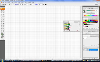
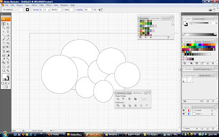
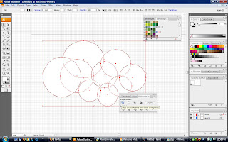
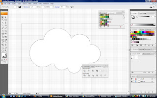
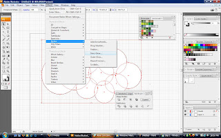
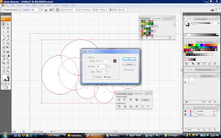
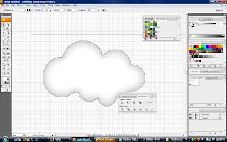
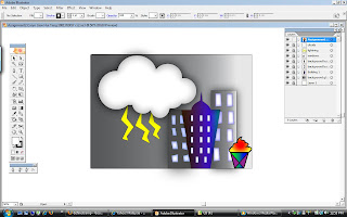
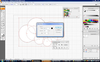
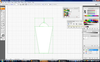
Step 1: I did some sketches. A rough idea of how I wanted my illustration to look like. Step 2: I started of by adding the grid, ruler and some personalize swatches. Step 3: I created another layer for the clouds. I first used the shape tool by using the eclipse shape to create a cloud-like shape. Step 3: I "select all" the circles and used the pathfinder. I click on the far left icon.

Step 4: Thus, I will have a cloud shape.
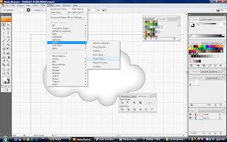
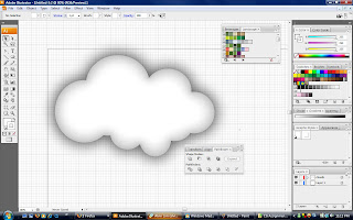
Step 5: I then "select all" the cloud and use the stylize tool. Using the "inner glow" and outer glow, The cloud looked more realistic


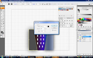
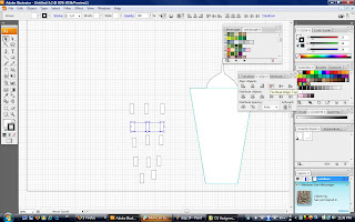
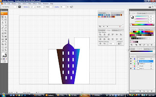
Step 6: I used the pen tool to create the first building.Step 6: I also used the pen tool to create windows for the building. All these I separated them into a few layers Step 7: I then added colour into the building. I use the gradient effect for the building. All the colours were taken from personalize swatches

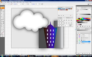
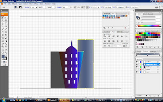
Step 8: Then, I created two background buildings using the pen tool.
Step 8: I also used the stylize tool where I added inner glow and outer glow to the buildings as well as the windows. I used some 'landscape' liked colours from the swatches. Step 9: this was the outcome.

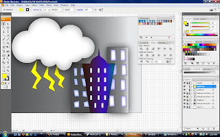
Step 10: I wasn't satisfied with the outcome. So i added some stuff. I added lightning rods using the pen tool and coloured it yellow. I added some windows which i created using the pen tool. I used the stylize tool as well and added some inner glow and outer glow. I created a background. I used the shape tool to create a rectangle for the back and used the gradient tool.

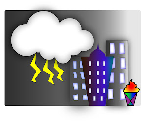
This is my final product. I know it's a little too simple.

Last step:
I forgot to add my logo from my assignment 1. = P
So I created another layer for the logo. Each item in the illustration has its own layer.

Final final final Image = )